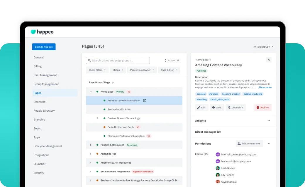
Work card
A case study in the work lists: visual, badges, outcome title and dates. The whole card is the link.
<WorkCard
  title="Redesigning admin oversight for a major CMS rebuild"
  date="01–06/2025"
  href="/work/governance"
  cover={{ src: '/work/governance/cover.webp', alt: '…' }}
  badges={[{ label: 'Happeo', color: 'var(--color-accent-happeo)' }, …]}
/>
Usage
- Visual: a
cover image (a transparent device-on-band render) or, until one exists, a Project visual placeholder in the client's colour. - Title: the outcome, matching the article title. Date: MM–MM/YYYY, muted.
- Hover: the card lifts 8px and the title underlines.
- Grid: one per row on mobile, two from 1024, three from 1920 (
--work-card-column).
Props
| Prop | Type | Default | Description |
|---|
title | string | — | Outcome-led title. |
date | string | — | e.g. 01–06/2025. |
href | string | — | The case study. |
cover | { src; alt } | — | Real cover image; replaces the placeholder. |
accentColor | string | var(--color-bg-accent-teal) | Placeholder visual colour (client accent). |
badges | { label; color? }[] | [] | Client + discipline, see Badges. |
Tokens
| Token | Base | ≥ 390 | ≥ 640 | ≥ 1024 | ≥ 1440 | ≥ 1920 | Note |
--work-py | 20px | var(--spacing-lg) | var(--spacing-3xl) | | 80px | | |
--work-card-column | 1 / -1 | | | span 3 | | span 2 | 2 cards per row |
--work-card-ratio | 1440 / 1080 | | | | | | card visual (Figma) |
--type-card-title-size | 28px | 32px | | 40px | 48px | | |
--type-card-date-size | 14px | 16px | | 24px | 32px | | |
--motion-lift-card | 8px | | | | | | work card on hover |