Key figures
- of all Happeo customers used the view in the last 30 days (121 of 293 accounts)
- 41%
- row interactions a month: admins open and work with Pages in the table every day.
- 1,600+
- The governance view was a hard dependency for migrating to the new CMS
- Pages 2.0 unblocked
-
Problem
No place for powerful governance
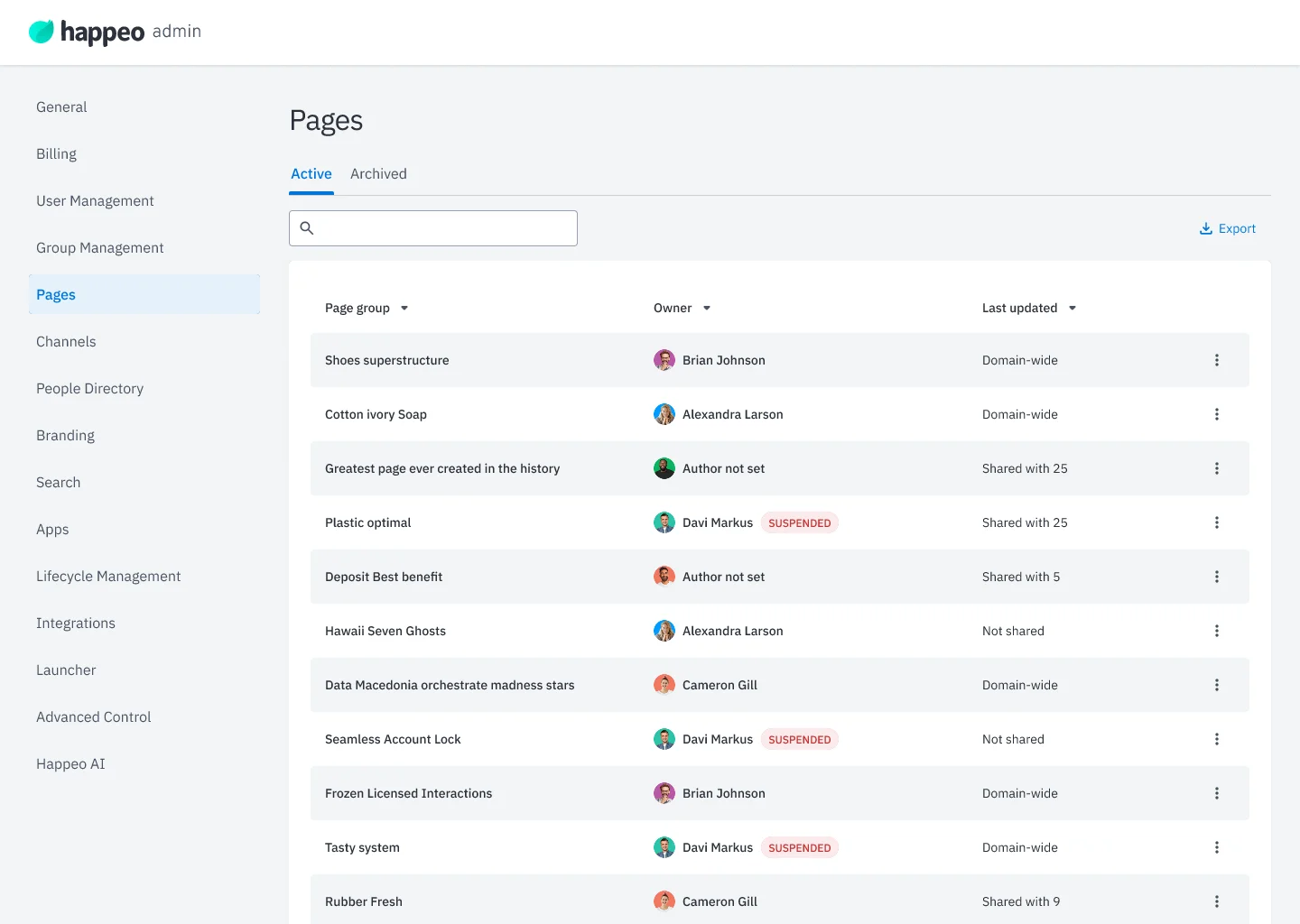
Admins had no single place to see all their Pages. The admin panel listed only Page groups, with search as the only filter, so even finding the right group was hard.
Any governance task, like checking an owner or changing permissions, meant opening each group in the Editor one by one. Customers had been reporting these pain points for years.
-
What was at stake?
Without a better view, admins would keep losing track of the content they were responsible for. Worse, Pages 2.0, the full rebuild of Happeo's CMS and the biggest release in the company's history, depended on it: admins needed a working way to see and govern existing content before it could be migrated. Pages 2.0 was critical to Happeo's roadmap and sales, and this view was a blocker for it.
Goals
- One view of everything All Pages and Page groups in one place, before the Pages 2.0 launch
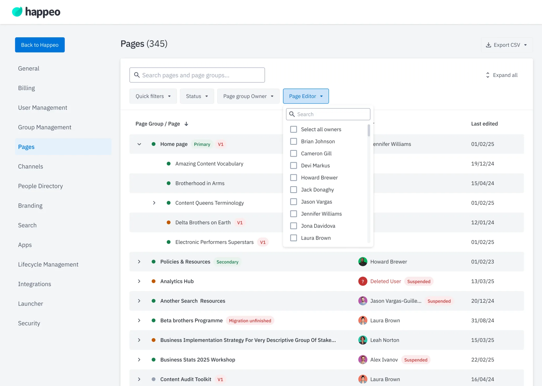
- Find and act fast Robust search, filtering by owner, editor and status, and bulk editing of permissions and statuses.
-
Discovery
Finding the right problem
Interviews
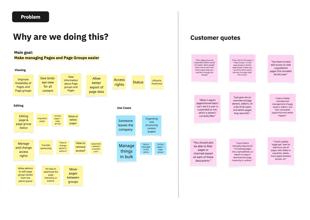
Before I joined, our PM interviewed 8 admins across our customer segments, from SMB to Enterprise. I joined the follow-up customer calls with the PM.
The research pointed clearly to three needs
- A central place to manage all Pages and Page groups
- Bulk editing of permissions and statuses
- Robust search and filters for actually finding Pages
-
Design iterations
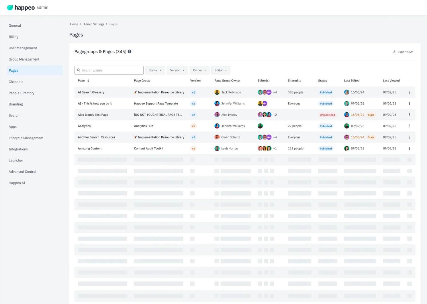
“I’ll just add a few more columns”
We had recently updated the User Management tables, so extending the existing table with new columns felt like the obvious move. Our design system in Figma made it quick to try.
Nope. It didn't work.
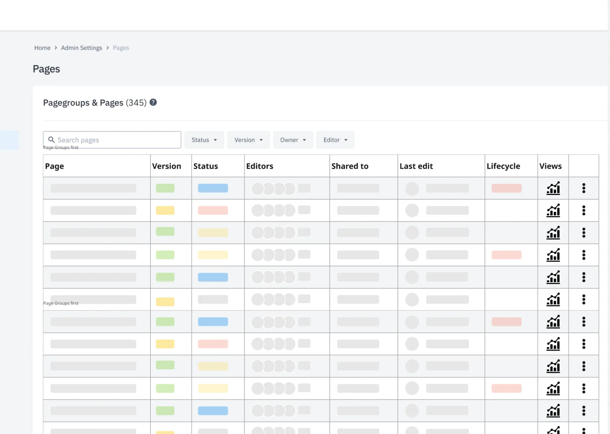
The admin panel's content sat in a 1380px container, so a wider table meant redesigning the whole panel, not just this view. And with every column added, the view got harder to read: preventing information overload turned out to be a much harder problem than I expected.
-
Back to discovery
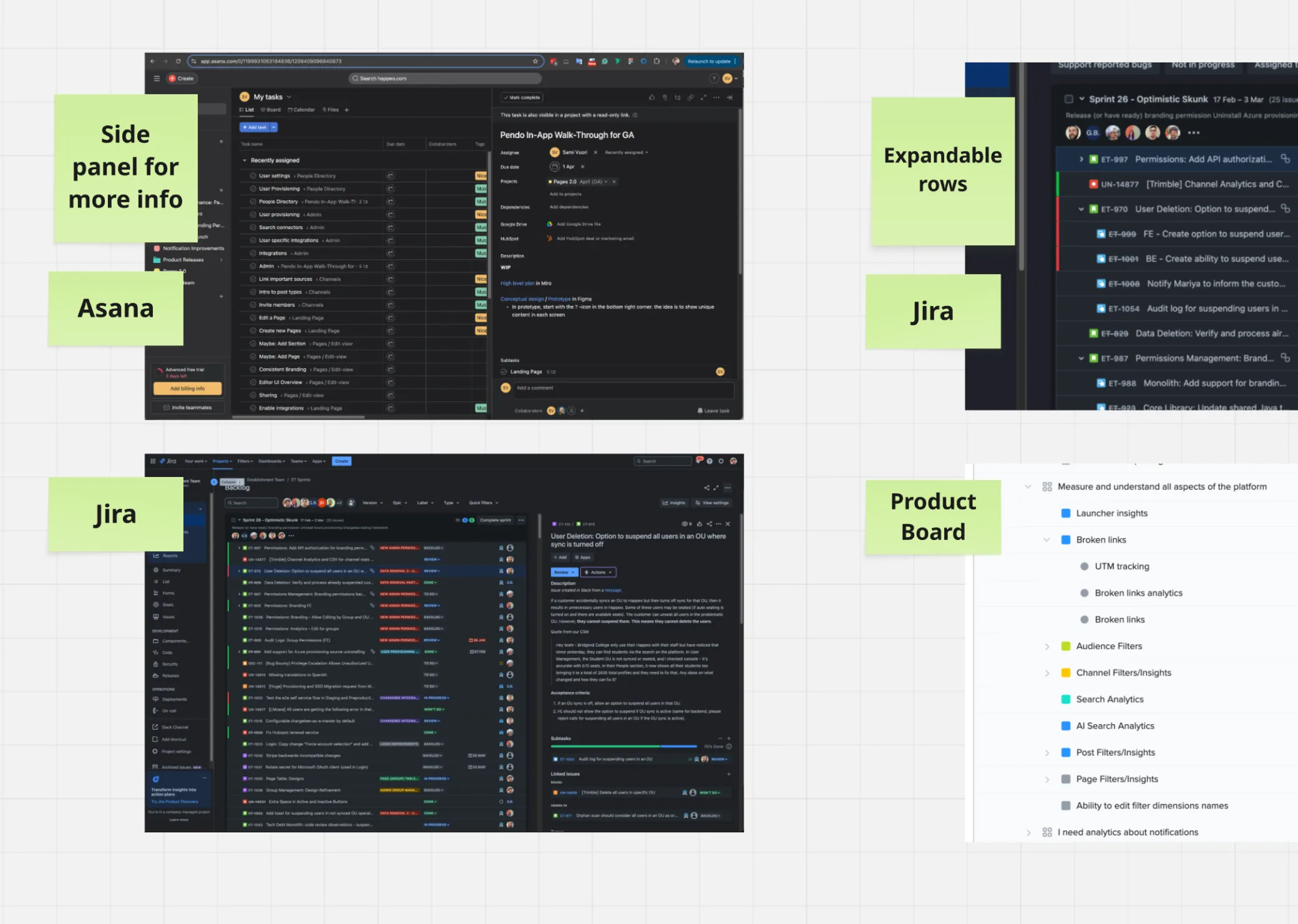
I expanded the competitor analysis to products that handle large amounts of hierarchical data, for example Google Drive, Dropbox, ProductBoard, Asana and Jira.
-
Gaining understanding
- Page and Page Groups on Separate Views Creating dedicated views for Page groups and Pages would help organize the data, but it would also compromise the hierarchical structure.
-
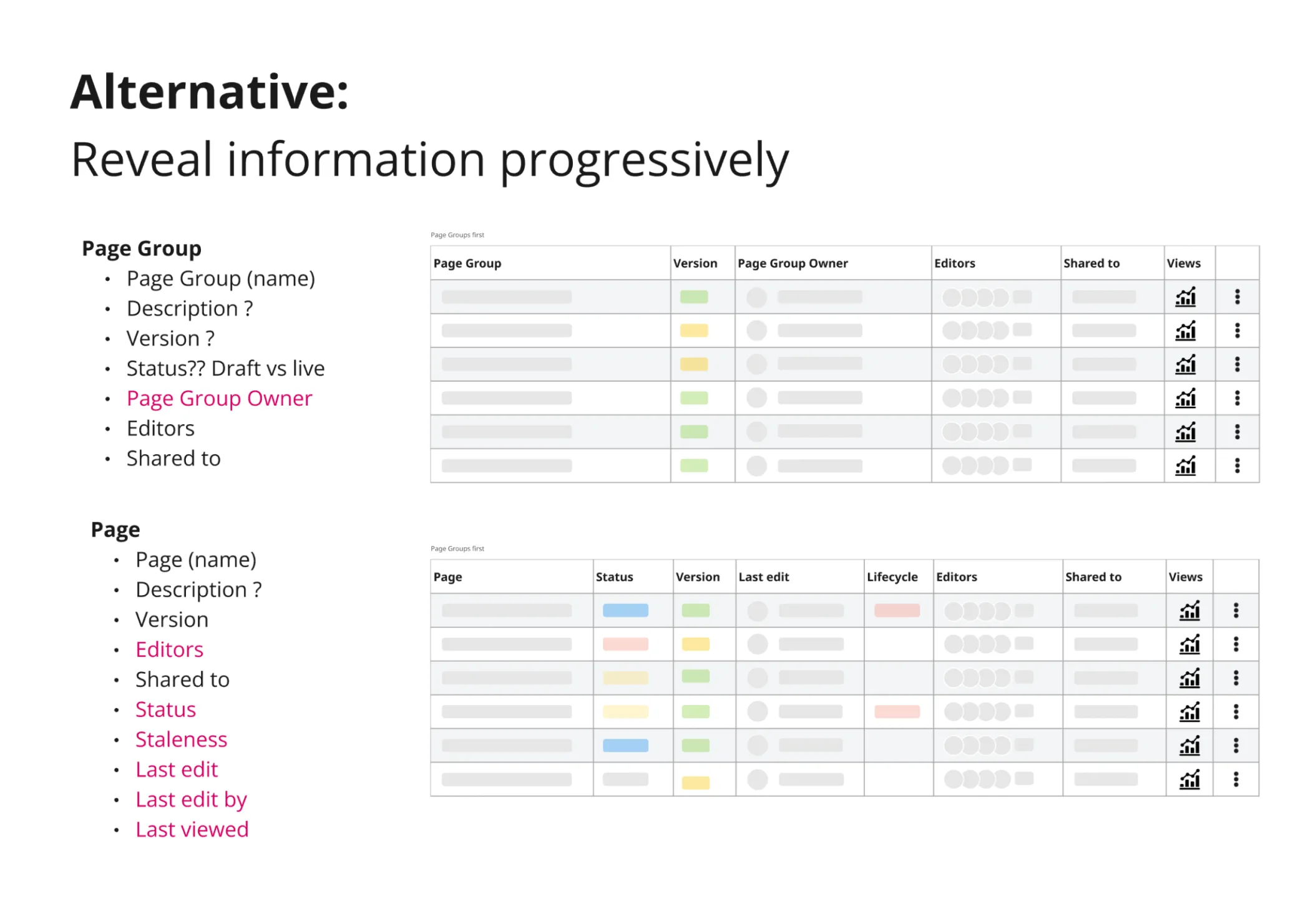
- Limit data per view Revealing information progressively would be more effective than displaying everything at once.
-
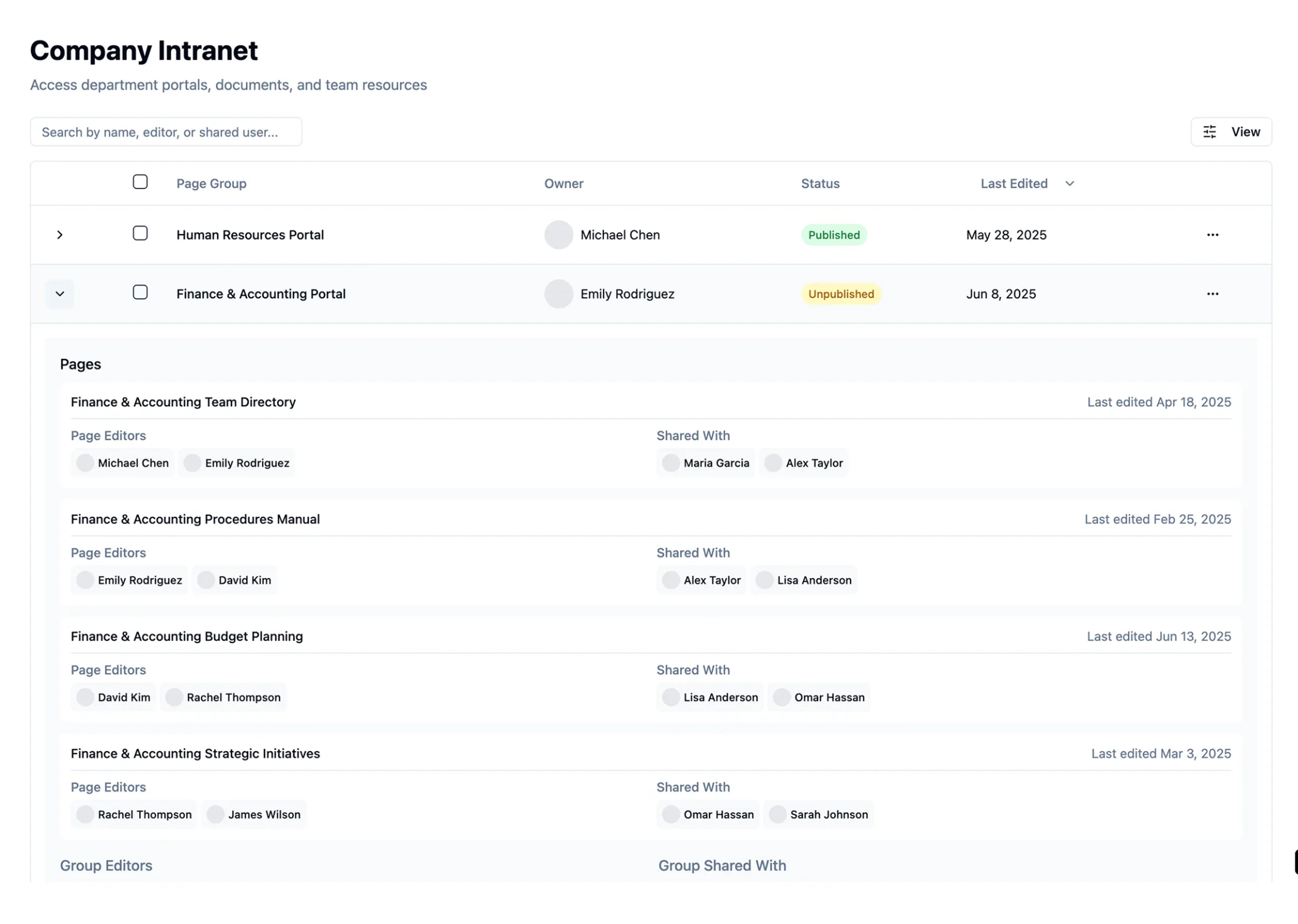
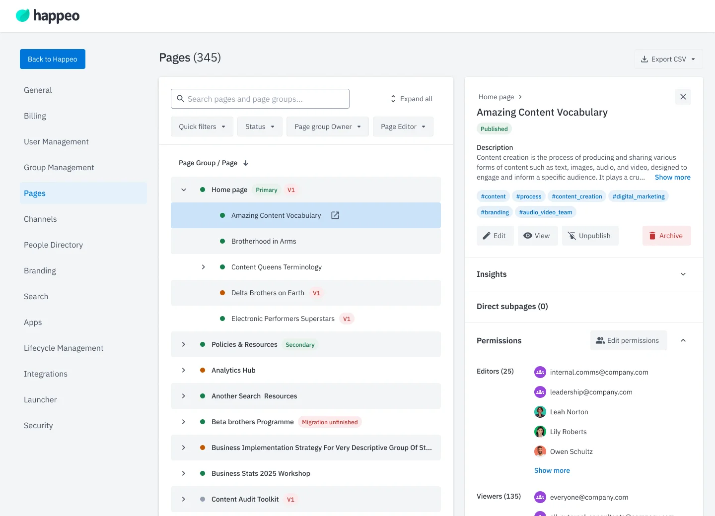
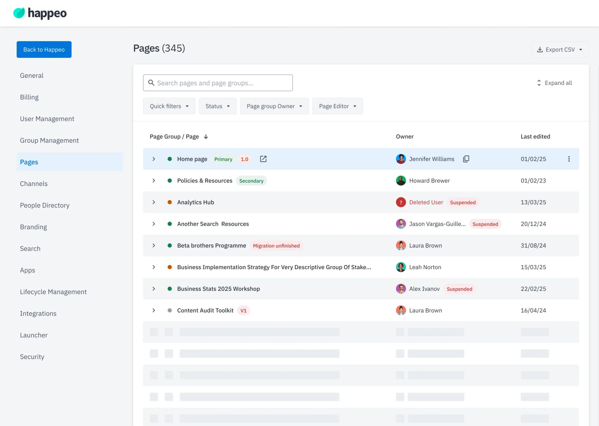
- Collapsible layout iteration My first ever Lovable experiments showed only Page groups first while Pages were hidden by default. This approach excited me, and I wanted to explore it further.
-
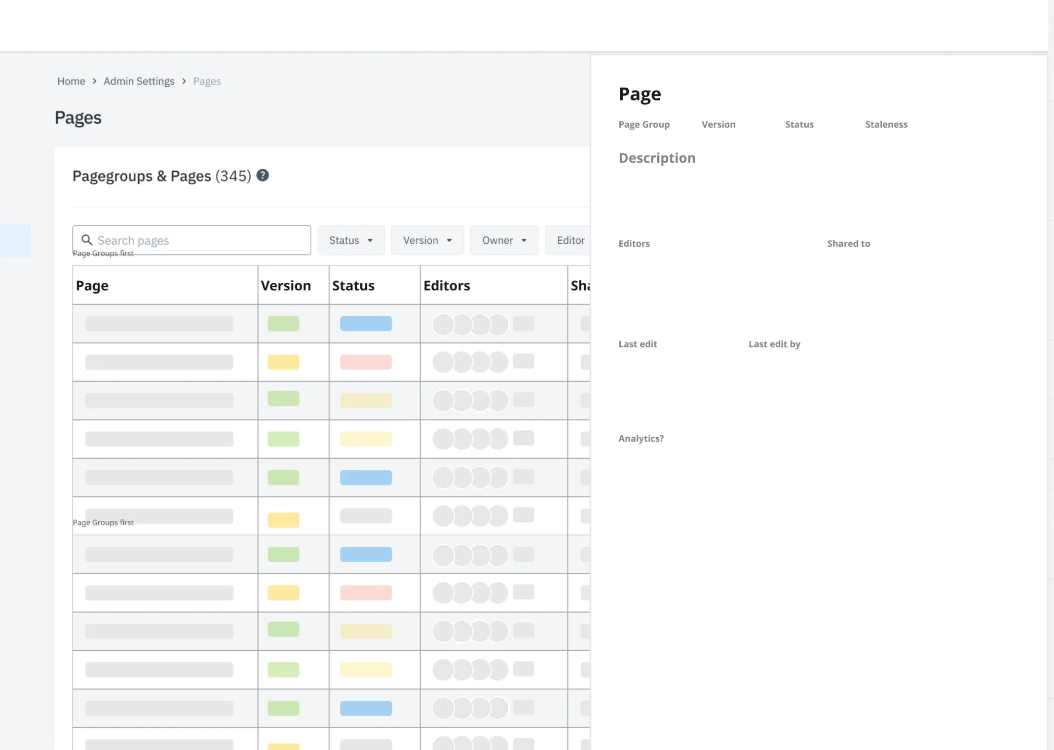
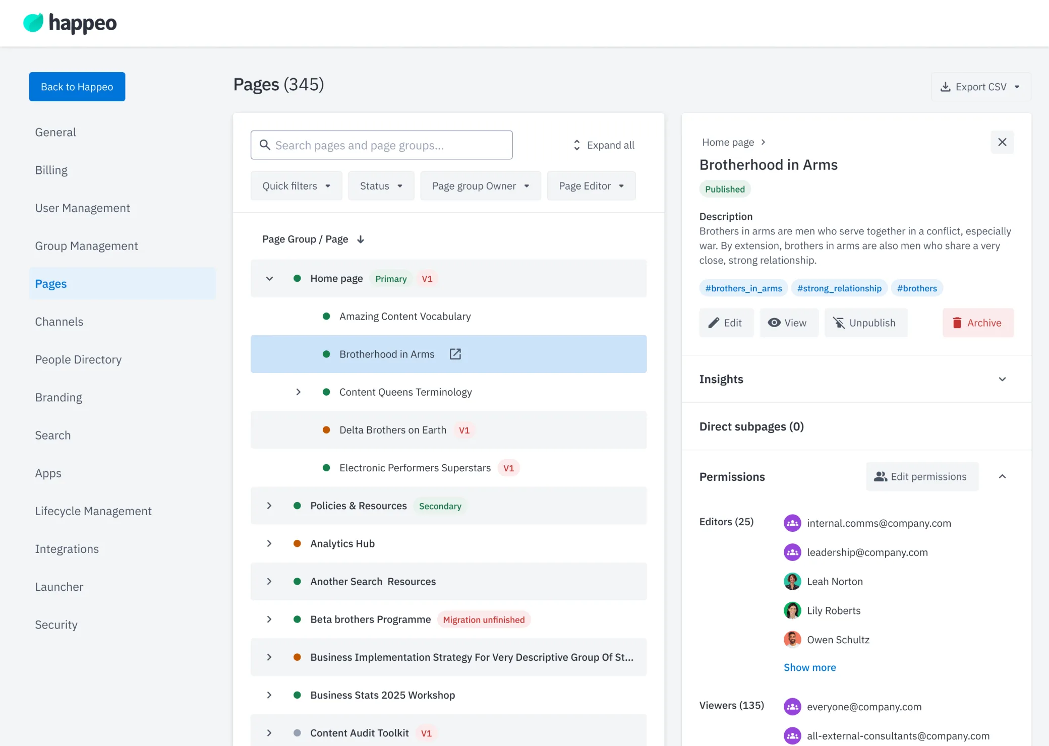
- Expanding Information in a Sidebar Inspired by products like Asana and Jira, I considered using a sidebar to expand detailed information. This would allow us to present a lot of content while keeping the main view simple and intuitive.
-
Validation & Beta
Customer validation
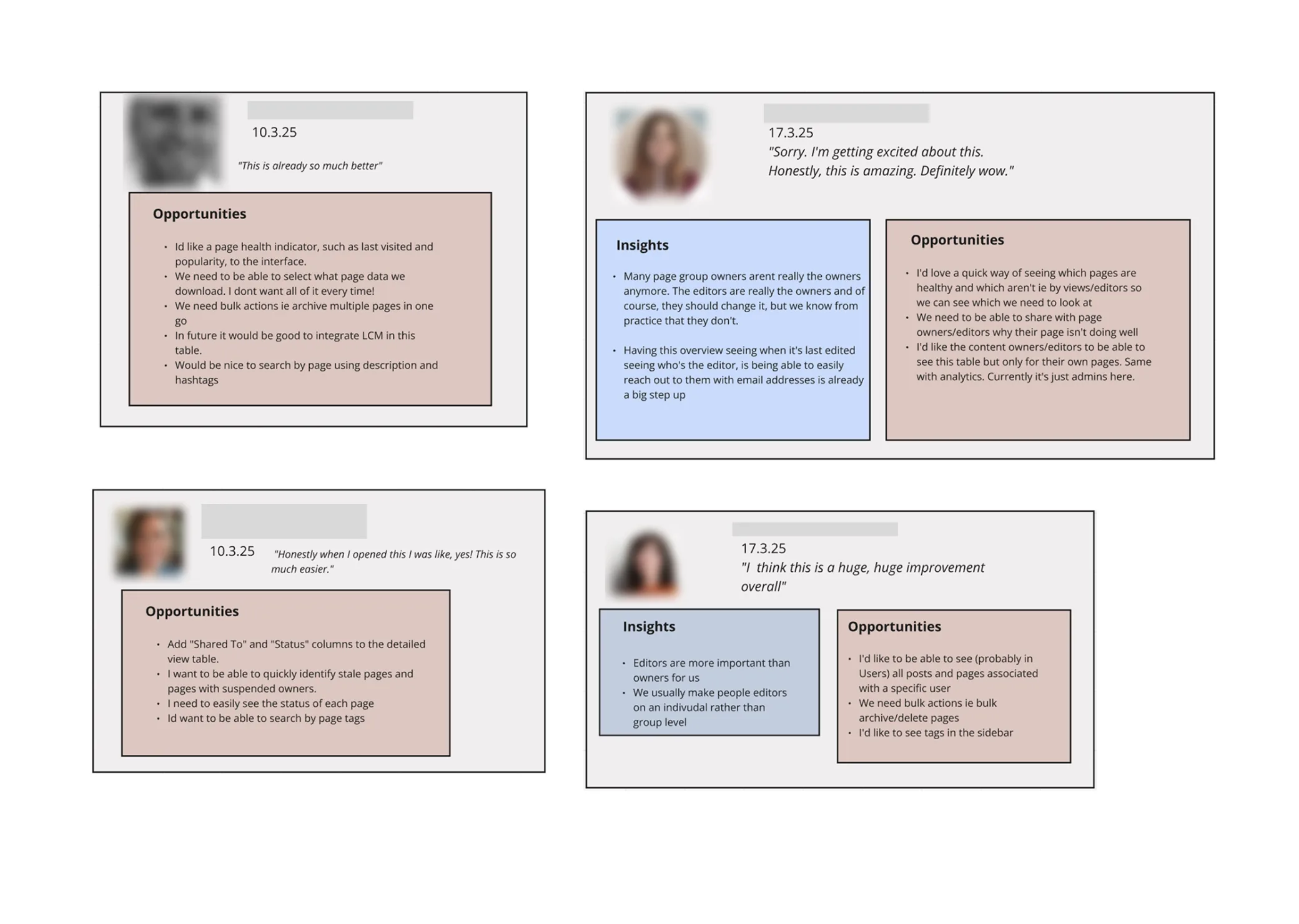
We validated the prototypes with the same admins and stakeholders we'd talked to in discovery. We tested the core interaction pattern, the sidebar detail view, and above all how search and filters behaved together with the Pages hierarchy.
The earlier table versions felt cluttered to internal stakeholders and customers alike; the sidebar version was clearly preferred by both.
-
Beta release to validate with real data
Prototypes only use mock-up content, and complex data views need the user's own data to really be judged. So I pushed to test in a closed Beta with customers' real data. We scoped the Beta tightly:
Beta requirements
-
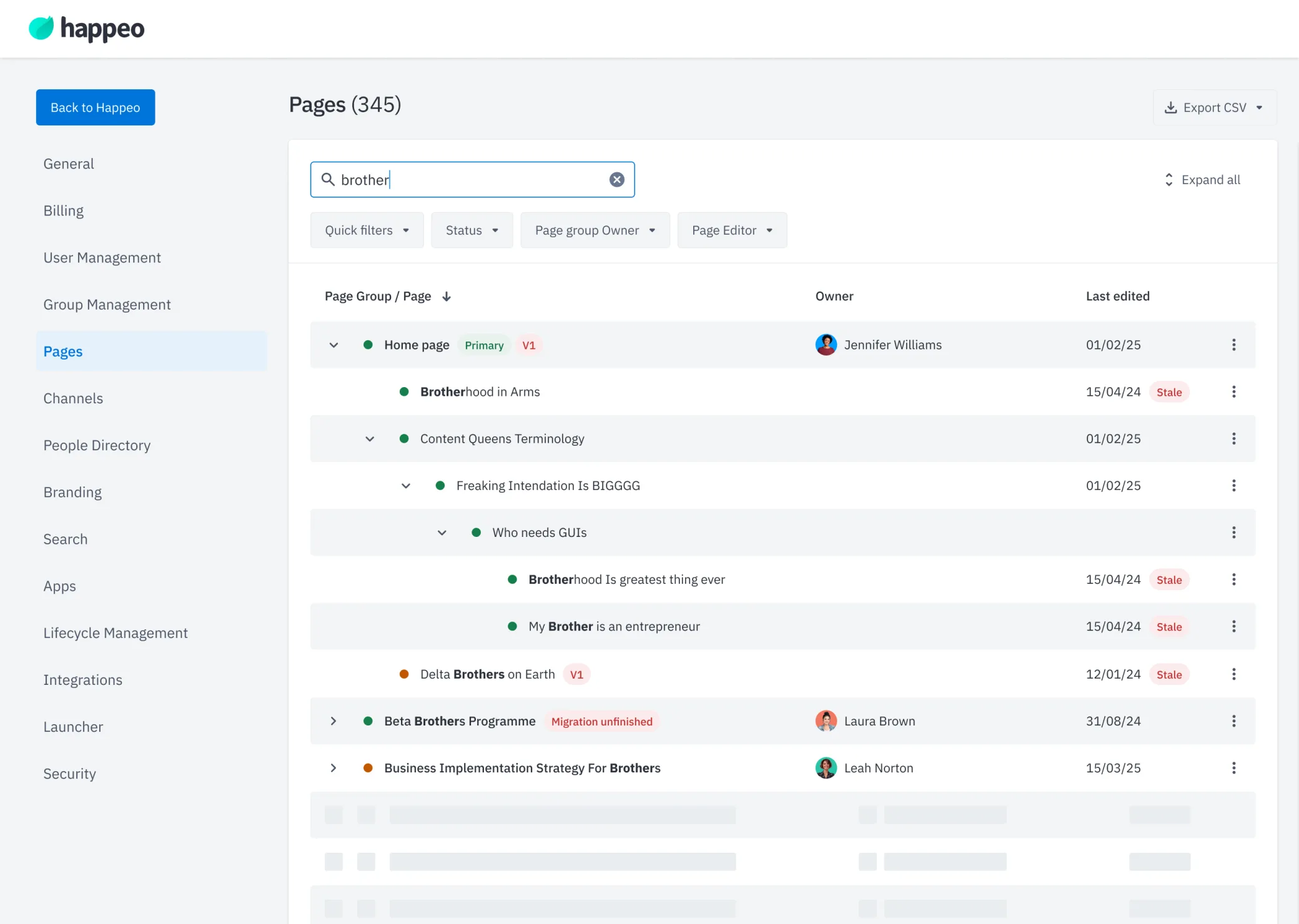
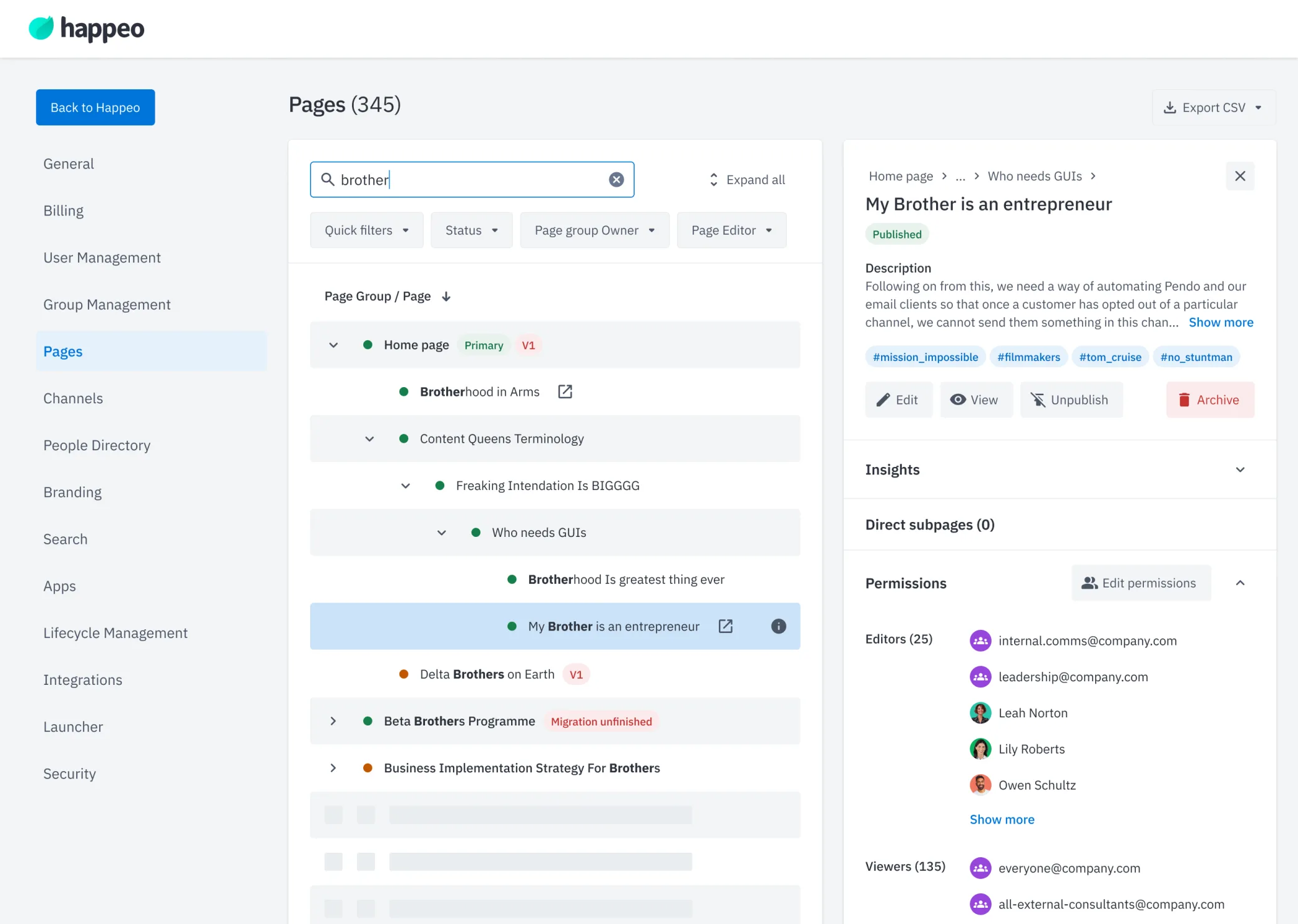
- Search Search across Pages and Page groups by name, description, and metadata
-
- Filters Filter by owner, editor and publishing status
-
- Detailed View Users can see all available Page details and actions in sidebar
-
- Pages Hierarchy Users can see the entire path from Page group's root to each subpage, even when applying filters
-
Honestly, when I opened this, I was like: ‘Yes! This is so much easier.’
Intranet Operations Lead Enterprise Software Company All customers really liked it and found not much complains.
-
Results
Limited measuring
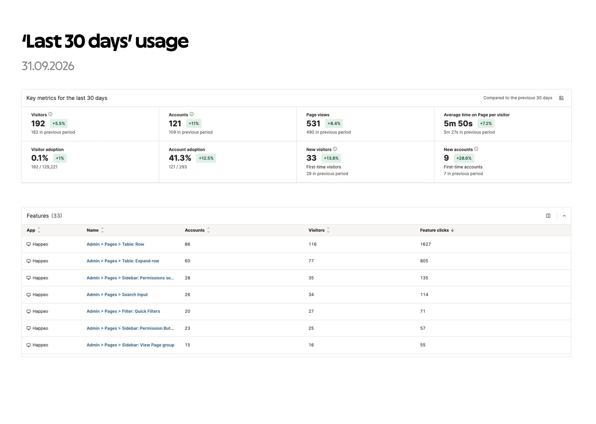
Qualitative feedback during validation, then usage data in Pendo from the Beta onwards.
After the Beta launched, my team was dissolved in a reorganisation and the Pages 2.0 team took the view over, so I wasn't part of the project from then on. They released it to all customers in late 2025, with an in-app guide announcing it.
-
The feedback held up
Usage data from September 2026 shows that 41% of all Happeo customers (121 of 293 accounts) had used the view in ‘the last 30 days’, and the admins who use it rely on its key features: opening rows and expanding the hierarchy are by far the most used actions, followed by permissions in the sidebar, search and quick filters.
It was a success!
Reflection
What took the most time
Finding the smartest way to show a large amount of data: deciding what was crucial to show and what could be hidden or removed. During Beta development, the hardest part was making search and filters work together with the expanding hierarchy, so that a filtered result still shows its full path from the root Page group.
What went wrong, and how I fixed it
My first instinct, adding columns to the existing table, ran into the 1380px container and information overload. Instead of forcing it, I went back to discovery, studied how other products handle hierarchical data, and explored four directions before landing on the sidebar.
What I'd do differently
- Observe admins in their real workflows earlier, before diving into the solution. Seeing their day-to-day work and workarounds would have given deeper insight into what the view needed.
- Ship step by step instead of one big release. Adding new functionality to the existing table as it was built would have given us customer insight much sooner.
Final thought
I learned a lot about designing complex data tables that need to hold real functionality without losing clarity. Powerful and clean turned out to be a much harder balance than it looks.